UX Improvements
A few quality-of-life improvements have been made throughout Enersight to address common requests and concerns. The details are as follows:
-
Network tab: three improvements have been made to the network tab.
- The first improvement is input, report, or graph modals remain on screen when you change scenarios. Previously, you had to re-open them. This enables rapid checking of inputs or results across multiple scenarios without having to re-open and re-configure a graph or report.
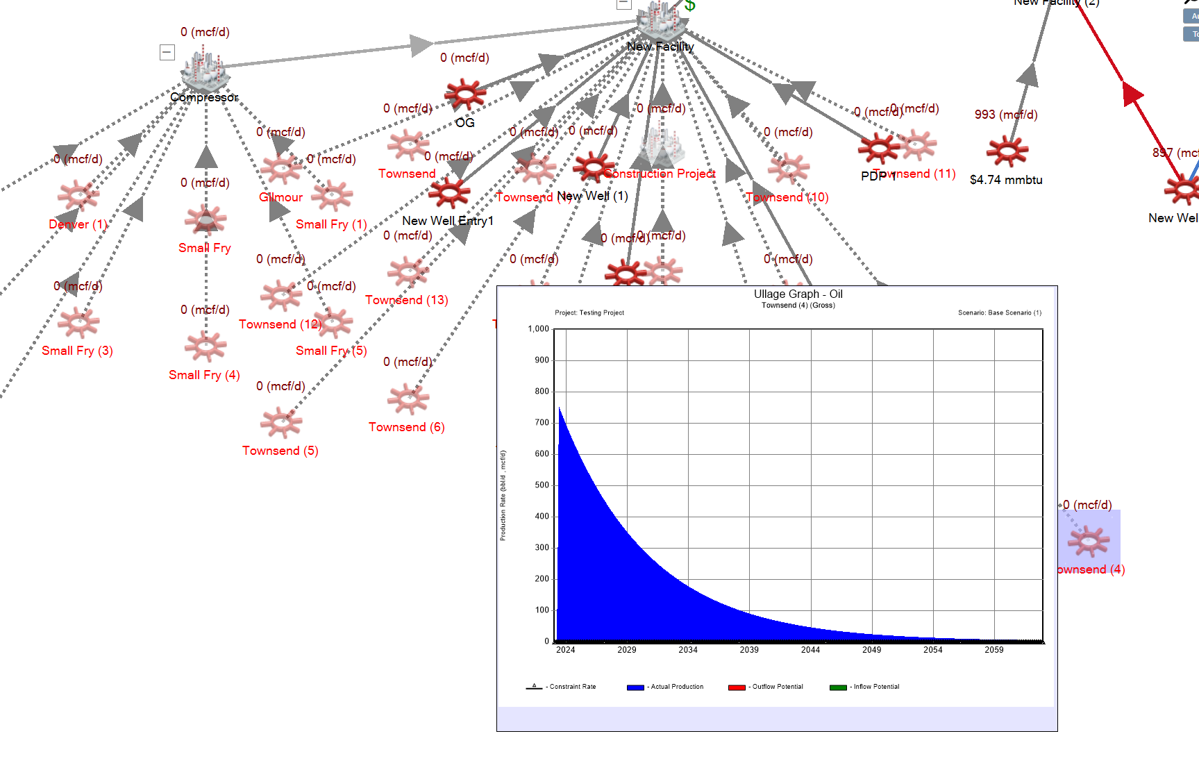
- The second is that when right-clicking on an asset on the Network tab, the report/graph is now placed on screen dependent on where the asset is located instead of always below and to the right of the asset. This reduces the need to move the map around to be able to read the report/graph when an asset is in an awkward position.
- The third improvement is that the Facility and Well Sub-type lists have been made more readable by adding spaces where appropriate (e.g., WellPad is now Well Pad) and alphabetized, and the Product and Variable drop down lists have had their readability improved as well.
Click image to expand or minimize.
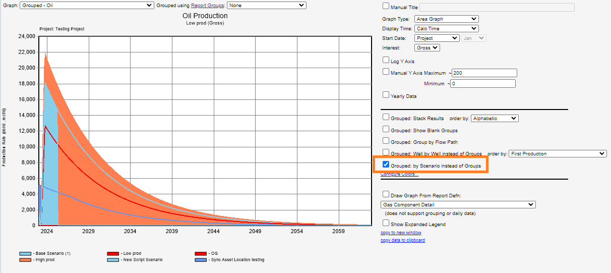
- Graphs – Group by Scenario: a new grouping option is available in the Graphs tab when viewing a ‘Grouped’ graph: Group by Scenario. Grouping by scenario allows you to compare results for an asset across scenarios on the same graph, allowing you to rapidly spot which scenario you may need to delve deeper in within your analysis process and save having to manually export data out to Excel to compare.
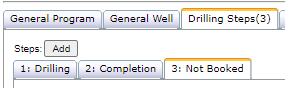
- Scheduler steps: are now labeled with the Booked As entry for each step to facilitate easier navigation through the schedule.
- When manually adding a new facility or well, the cursor defaults to the Asset Name input field.
Click image to expand or minimize.